This project began with a simple curiosity: what kind of information can world maps and globes reveal? I was inspired after discovering the Johns Hopkins COVID-19 map, a premier example of a Data Visualization Dashboard. It was incredibly useful during the pandemic because it provided near real-time insights into global events, helping people understand how to prepare for what was coming next.
In this experiment, I utilized two primary datasets: global earthquake data dating back to 1965 and global retail sales data. Through these visualizations, we can pinpoint earthquake locations and their magnitudes on a 3D globe. For the second dataset, we can identify regions with high store density, track fluctuations in profit and loss across a map, and distinguish between saturated markets and those with expansion potential, despite possible logistical challenges.
YEAR
2026
ROLE
Analyst
3D Visualizer
CONTRIBUTIONS
Analysis
3D Visualization
About the project
Technical Constraints and Tools
I should note that the current renders are not high-end. My computer is not particularly powerful, and the free version of Houdini limits rendering to 720p. Even a few seconds of footage can take hours to process, and I wanted to avoid excessive hardware downtime.
This project focuses on the 'fun' side of visualization. I did not prioritize complex ETL processes, data cleaning, or deep exploratory data analysis. I was simply looking for accessible datasets to visualize creatively. As an artist, using standard BI tools felt too conventional. Instead, I turned to Houdini, a world-class VFX software I used during my student days. Although I had forgotten much of it, I recalled its power in data manipulation through VEX or Python.
Project 1: Visualizing Global Earthquakes
I sourced the data from Kaggle, which was already somewhat organized. For the earthquake visualization, I focused on four essential columns:
Date of occurrence
Latitude (X-axis)
Longitude (Y-axis)
Magnitude (Intensity)
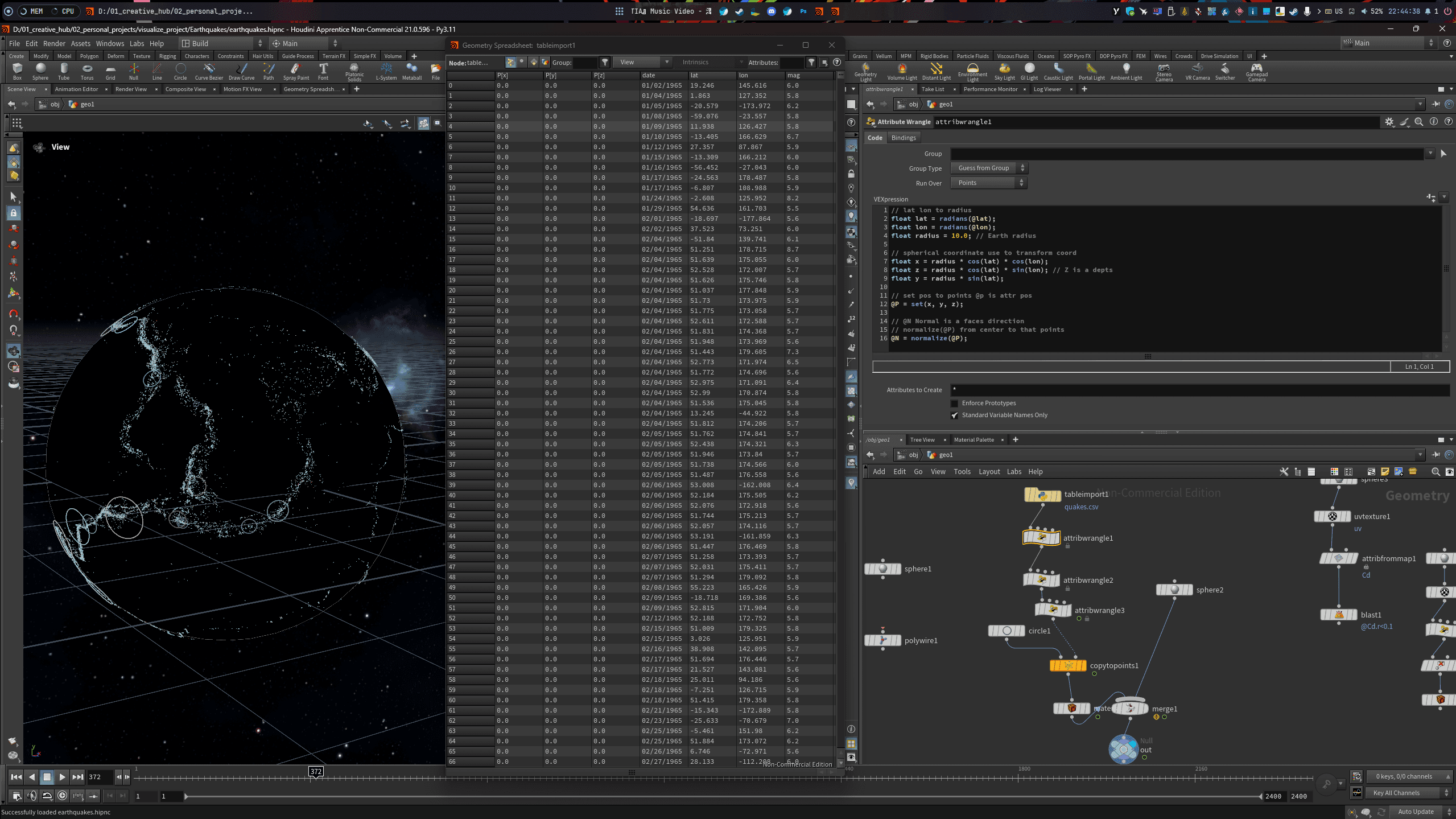
I imported the CSV file into Houdini using the Python Table node, which allows for easy column selection via index. Houdini naturally treats data as vectors or matrices. To visualize this, I converted the data into particles or points to create a 3D scatterplot.
Creating the Effects
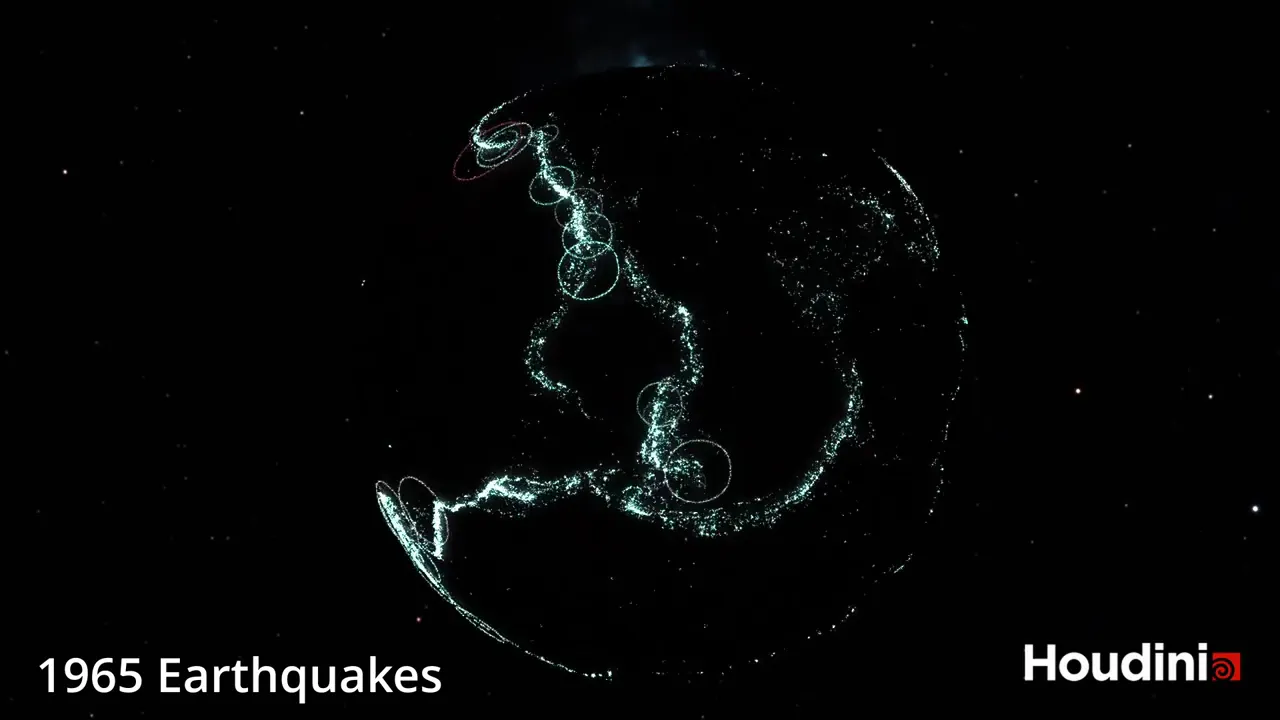
Mapping: I converted the latitude and longitude coordinates to fit a spherical global coordinate system.
Visuals: Rather than a detailed globe, I used a black sphere to make the earthquake effects pop.
The Rings: Using the Copy to Points node, I placed circles at each epicenter. I oriented them to face the center of the sphere so the rings laid flat against the earth's surface.
Scaling and Color: The size of the rings represents the magnitude. I used blue for standard intensity and red for high-magnitude events.
Animation: To make it dynamic, I coded a script to display events based on their actual date, allowing them to fade out over a 30-day window to show overlapping activity.
Project 2: Global Sales and Profitability (2014)
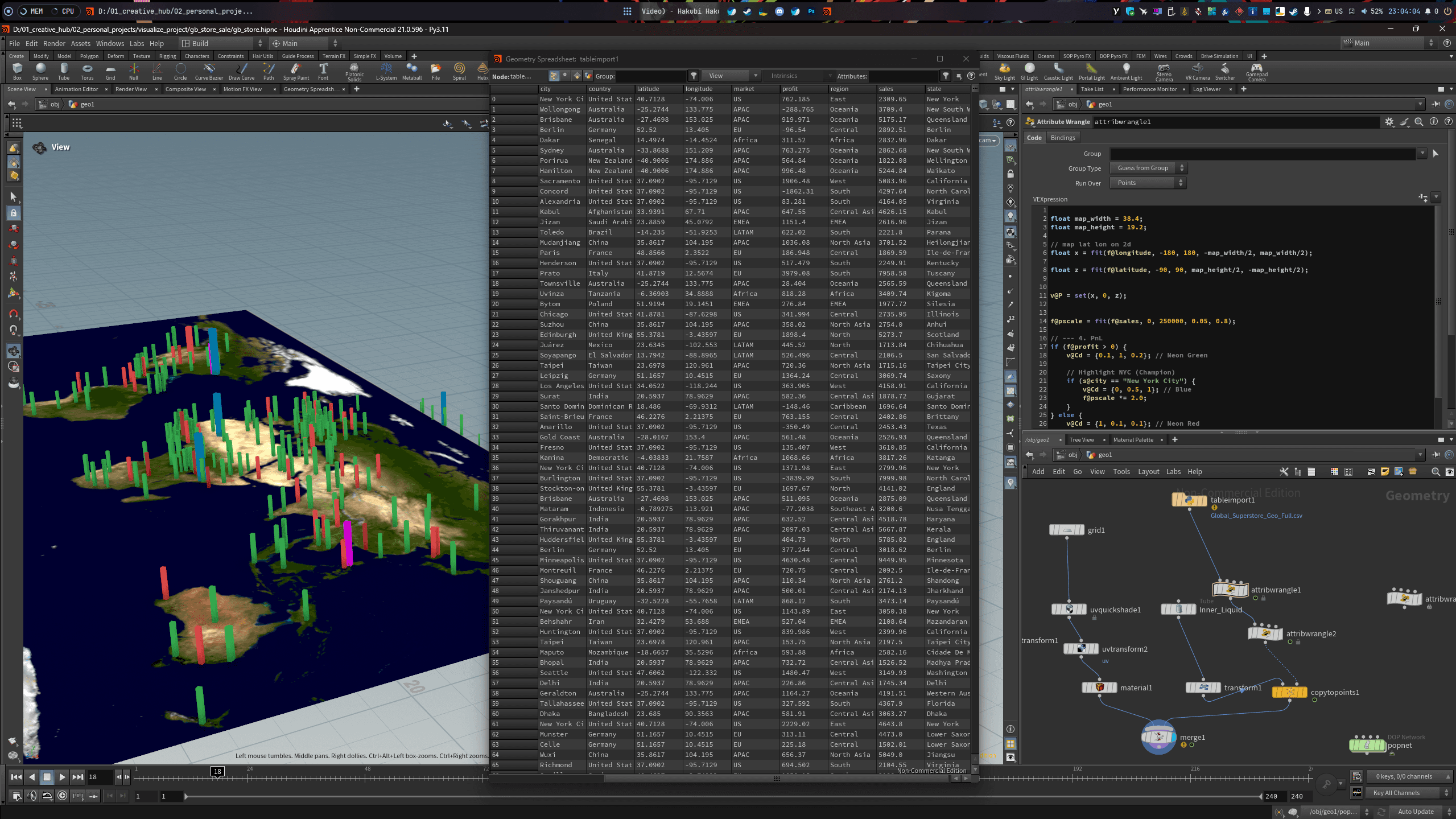
The sales dataset was unique because it provided city names but lacked geographic coordinates. To solve this, I used LLMs (Large Language Models) to generate a CSV mapping city names to latitude and longitude.
Visualization Strategy
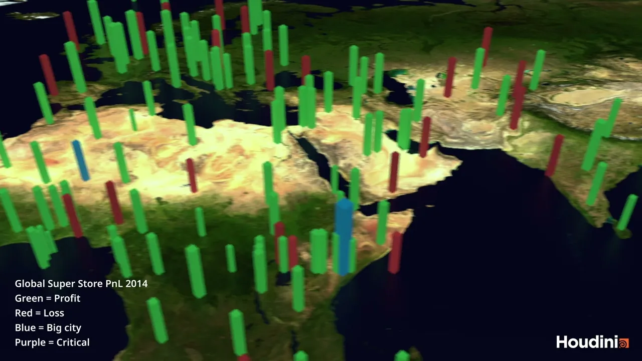
The goal was to visualize Profit and Loss (PnL) across different regions using a 3D Bar Chart:
Green Bars: Profitable areas.
Red Bars: Losses.
Blue Bars: Major hub cities (High revenue).
Purple Bars: Critical status/Significant crisis.
I mapped a world texture onto a 3D grid and converted the coordinates to fit a 2D plane. By placing the bars at their respective locations, I could identify market density. For instance, the European zone appeared extremely crowded, indicating a saturated market. In contrast, isolated bars in other regions highlighted growth opportunities where competition is lower, though logistics might be a hurdle.
Summary and Reflections
This rapid project took less than a day to complete. I relied on LLMs for coding assistance in Python, as my background is primarily in C# and it had been a long time since I practiced programming.
I hope this project provides some value or inspiration to those interested in the intersection of data and visual effects.
Would you like me to explain the specific VEX snippets used for the coordinate conversion or help you find similar datasets for your own project?
This project began with a simple curiosity: what kind of information can world maps and globes reveal? I was inspired after discovering the Johns Hopkins COVID-19 map, a premier example of a Data Visualization Dashboard. It was incredibly useful during the pandemic because it provided near real-time insights into global events, helping people understand how to prepare for what was coming next.
In this experiment, I utilized two primary datasets: global earthquake data dating back to 1965 and global retail sales data. Through these visualizations, we can pinpoint earthquake locations and their magnitudes on a 3D globe. For the second dataset, we can identify regions with high store density, track fluctuations in profit and loss across a map, and distinguish between saturated markets and those with expansion potential, despite possible logistical challenges.
YEAR
2026
ROLE
Analyst
3D Visualizer
CONTRIBUTIONS
Analysis
3D Visualization
About the project
Technical Constraints and Tools
I should note that the current renders are not high-end. My computer is not particularly powerful, and the free version of Houdini limits rendering to 720p. Even a few seconds of footage can take hours to process, and I wanted to avoid excessive hardware downtime.
This project focuses on the 'fun' side of visualization. I did not prioritize complex ETL processes, data cleaning, or deep exploratory data analysis. I was simply looking for accessible datasets to visualize creatively. As an artist, using standard BI tools felt too conventional. Instead, I turned to Houdini, a world-class VFX software I used during my student days. Although I had forgotten much of it, I recalled its power in data manipulation through VEX or Python.
Project 1: Visualizing Global Earthquakes
I sourced the data from Kaggle, which was already somewhat organized. For the earthquake visualization, I focused on four essential columns:
Date of occurrence
Latitude (X-axis)
Longitude (Y-axis)
Magnitude (Intensity)
I imported the CSV file into Houdini using the Python Table node, which allows for easy column selection via index. Houdini naturally treats data as vectors or matrices. To visualize this, I converted the data into particles or points to create a 3D scatterplot.
Creating the Effects
Mapping: I converted the latitude and longitude coordinates to fit a spherical global coordinate system.
Visuals: Rather than a detailed globe, I used a black sphere to make the earthquake effects pop.
The Rings: Using the Copy to Points node, I placed circles at each epicenter. I oriented them to face the center of the sphere so the rings laid flat against the earth's surface.
Scaling and Color: The size of the rings represents the magnitude. I used blue for standard intensity and red for high-magnitude events.
Animation: To make it dynamic, I coded a script to display events based on their actual date, allowing them to fade out over a 30-day window to show overlapping activity.
Project 2: Global Sales and Profitability (2014)
The sales dataset was unique because it provided city names but lacked geographic coordinates. To solve this, I used LLMs (Large Language Models) to generate a CSV mapping city names to latitude and longitude.
Visualization Strategy
The goal was to visualize Profit and Loss (PnL) across different regions using a 3D Bar Chart:
Green Bars: Profitable areas.
Red Bars: Losses.
Blue Bars: Major hub cities (High revenue).
Purple Bars: Critical status/Significant crisis.
I mapped a world texture onto a 3D grid and converted the coordinates to fit a 2D plane. By placing the bars at their respective locations, I could identify market density. For instance, the European zone appeared extremely crowded, indicating a saturated market. In contrast, isolated bars in other regions highlighted growth opportunities where competition is lower, though logistics might be a hurdle.
Summary and Reflections
This rapid project took less than a day to complete. I relied on LLMs for coding assistance in Python, as my background is primarily in C# and it had been a long time since I practiced programming.
I hope this project provides some value or inspiration to those interested in the intersection of data and visual effects.
Would you like me to explain the specific VEX snippets used for the coordinate conversion or help you find similar datasets for your own project?